Category: Guides & Insights

  • How to Care for Oil Paintings: A Practical Guide for Collectors

    How to Care for Oil Paintings: A Practical Guide for Collectors

    An oil painting is a layered object: canvas or board, a ground, layers of paint bound in drying oil, and often a protective varnish on top. Each of those layers reacts to its surroundings, which is why a little care goes a long way.

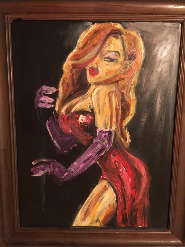
    This guide covers the everyday habits that matter most if you own an oil painting, with Jessica, an oil on canvas by Chen Bachar (45×65 cm), as our example. None of it requires special equipment, only attention.

    Jessica · Oil on canvas · 45×65 cm – View the artwork

    Light: bright rooms, but no direct sun

    Ultraviolet light and strong daylight slowly fade some pigments, and over time they can yellow varnish or make it brittle. The simplest rule is to keep an oil painting out of direct sunlight, including the patch of sun that crosses a wall for an hour every afternoon.

    Indirect daylight and ordinary LED lighting are fine. If you want to light a painting, LED picture lights or ceiling spots that give off little heat and almost no UV are a safer choice than older halogen bulbs placed close to the surface.

    Humidity and temperature: keep them steady

    Canvas, wooden stretchers and paint layers all expand and contract as humidity and temperature change. Sudden swings do more harm than a slightly imperfect but stable climate, because repeated movement is what leads to cracking and flaking over the years.

    Aim for a normal, comfortable home climate: roughly 18–24°C and moderate relative humidity, around 40–60%. Avoid hanging oil paintings above radiators, fireplaces or heaters, next to air-conditioning vents, on damp outside walls, or in bathrooms and kitchens where steam and grease collect.

    My choice of materials depends on the message I want to pass on.

    Chen Bachar, ARTiculAction Art Review

    Dusting: a soft brush, never water or cleaners

    Dust is the thing owners deal with most. Every few months, take a clean, dry, soft brush, such as a wide natural-hair brush or a soft make-up brush, and sweep lightly from top to bottom while holding the painting steady by its frame.

    Do not use water, damp cloths, household cleaners, glass sprays, polish or home remedies such as bread or potato. They can seep into cracks, dissolve varnish or leave a residue. Feather dusters and microfibre cloths can catch on raised brushstrokes or loose flakes of paint, so a brush is gentler. If a painting looks dirty rather than dusty, that is a job for a professional.

    Handling, hanging and transport

    Handle a painting with clean, dry hands or cotton gloves, holding it by the sides of the frame or stretcher rather than by the top edge alone. Avoid touching the paint surface, and never press on the canvas from the front or the back: a small dent today can become a crack later.

    When hanging, use two hooks rated for the weight and check the wire and fixings from time to time. Before moving a painting, cover its face with acid-free glassine or clean paper, then add padding and corner protectors; bubble wrap pressed straight onto paint can leave marks. Carry and store paintings upright, never stacked flat with weight on top. A recently painted oil can stay soft for months, so take extra care with new work.

    When to call a conservator, and a note on acrylics

    Contact a professional conservator if you notice flaking or lifting paint, new cracks, a tear or dent in the canvas, mould, water damage, or varnish that has turned noticeably yellow or cloudy. Do not try to glue, retouch or clean it yourself; well-meant home repairs are often the hardest to undo.

    Acrylic paintings need similar care, with a few differences. Acrylic paint stays more flexible than oil, but its surface is softer and tends to attract and hold dust; it becomes brittle in the cold and slightly tacky in heat. Keep acrylics away from temperature extremes too, and dust them just as gently. For more on the two media, see oil vs acrylic painting.

    Chen Bachar chooses his medium according to what a painting needs to say. You can browse his oil paintings, and if you own one of his works and have a question about it, the contact page is the place to ask.

    More articles

    • Why Buy Art from the Artist: What a Living Painter Gives You
    • Art as a Gift: How to Choose a Painting Someone Will Love
    • Becoming an Artist Later in Life: Programmer, Designer, Painter
    • Venice Oil Painting: Light on Water in "Venice Window"
    • Oil vs Acrylic Painting: How the Choice Shapes the Work
    • Painting from Photographs Without Copying Them

  • Painting Women: Why Chen Bachar Returns to the Feminine

    Painting Women: Why Chen Bachar Returns to the Feminine

    Look through Chen Bachar’s oil and acrylic paintings and one subject keeps returning: women. Some are named, some are known only by a single word, and each is painted differently. Painting women is one of the oldest themes in art, and it is easy to do carelessly. Chen approaches it as a question of balance.

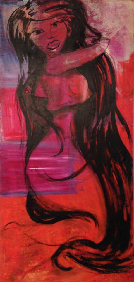
    This article looks at what he has said about the feminine in his work, and then walks through the women portraits in his catalogue. The featured image is his acrylic Red Woman.

    Red Woman · Acrylic on canvas – View the artwork

    People first

    Asked about his main source of inspiration, Chen answered simply: “People fascinate me.” He spoke of the moments people go through, and of trying to understand the person before painting them.

    That starting point matters when painting women. The question is not only how a woman looks, but who she is, what she carries and what she has lived through. In his descriptions of his own portraits, he keeps returning to strength, patience, nobility and life story, not only to beauty.

    Masculine and feminine: a matter of balance

    Chen compares painting to writing a piece of music, where every instrument carries some weight. In a painting, he says, there are sharp and strong parts that connect to a masculine energy, and tender, delicate parts that belong to the feminine side. He calls this his connection to his own feminine side.

    For him, the balance between the two is the heart of the work, in the colours as well as in the lines, so that the painting carries an authentic feeling. Seen this way, his women portraits are not only pictures of women. They are also places where he looks for that balance in himself.

    It's the same in painting, there are my extremists, sharp and strong parts, that connects to a very masculine energy, and tenderness, pleasant, delicate feminine side.

    Chen Bachar, ARTiculAction Art Review

    A tour of the portraits

    African Woman (oil on canvas, 120×80). Chen has said he wanted to show a woman who is soft and gentle and at the same time noble and strong. He worked from a photograph that held his attention for days before he decided to paint her. Read the story of African Woman.

    Gipsy (oil on canvas, 120×80). Here, in his words, the aim was to emphasise the power of the woman: her patience in the face of life and her feminine containment against her strength, expressed in body language, colour, line and shading. More in Gipsy and the power of a woman.

    Mama Rachel (oil on canvas, 80×120). A large vertical oil portrait with its own article: Mama Rachel, from programmer to painter.

    Thoughts (oil on canvas, 60×60). A small square painting that Chen describes as the beginning of a search for a line that speaks from the subconscious. He chose orange for creativity and vitality and purple for spirituality and a strong femininity. Read Thoughts: realism and the subconscious.

    More women in the collection

    Several other paintings belong to the same thread. Lolita (oil on canvas, 110×60) and Eve (oil on canvas, 80×60) are mid-sized oil works. Jessica (oil on canvas, 45×65) is a smaller, more intimate oil portrait.

    Red Woman, the image at the top of this article, is an acrylic on canvas. Its title puts colour first, which links it to something Chen has said about his methods: that he uses strong colours to express an inner shout or the optimism of childhood. Placed next to the oil portraits, it shows how the same subject changes with the medium.

    Seen together, these works show a long and varied conversation with one subject, painted at different sizes, in different media and with different moods.

    Looking with respect

    Portraits of women have a complicated history in art, and viewers today rightly ask how a woman is seen in a painting and by whom. Chen’s own words give one answer: he speaks of strength, dignity, patience and inner life, and of looking for the feminine in himself rather than only in the model.

    The best way to judge is to look slowly. Spend a few minutes with each portrait, notice where the painting is sharp and where it is soft, and ask what kind of person it suggests. Then decide for yourself.

    More articles

  • How to Choose Art for Your Living Room: A Practical Guide

    How to Choose Art for Your Living Room: A Practical Guide

    The living room is usually the first wall guests see and the one you look at most. Choosing art for it can feel like a big decision, but a few simple principles make it much easier.

    This guide covers scale, colour, format, groupings and light, with examples from real canvas sizes in Chen Bachar’s catalogue, from large 140 × 140 cm acrylics to small 45 × 35 cm oils.

    Fame · Oil on canvas · 110×50 cm – View the artwork

    Start with scale: the two-thirds guideline

    The most common mistake is a painting that is too small for its wall. A widely used guideline is that art hung above a sofa or sideboard should be about two-thirds of the furniture’s width. Some designers go up to three-quarters.

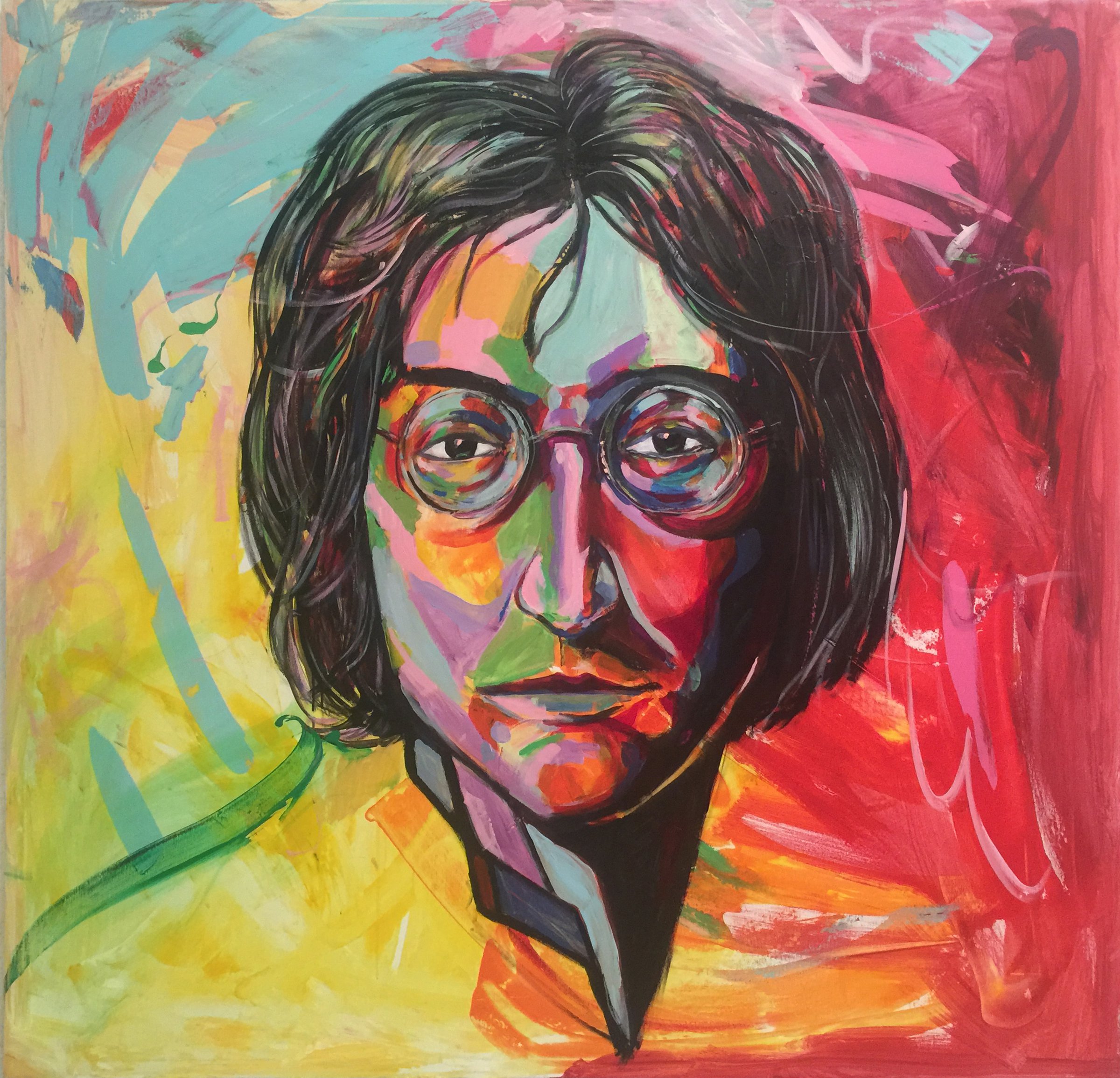
    For a sofa about 210 cm wide, that means a work of roughly 140 cm across. A square canvas like Chen’s John Lennon or Amy Winehouse, both 140 × 140 cm acrylics, fits that kind of wall well.

    On a large empty wall with no furniture, think about the wall itself. A big canvas such as Steve Jobs (160 × 170 cm) can hold a whole wall on its own. Before you decide, mark the size on the wall with painter’s tape and live with it for a day.

    Colour and mood

    A painting does not need to match your cushions. It is usually better to choose one or two colours from the work that echo something in the room, and let the rest stand out.

    Think about the mood you want. Warm reds and oranges feel lively and close; blues and greens feel calmer and more distant. Strong contrast draws attention, while muted tones sit more quietly in a space.

    Most of all, choose something that moves you. A painting you love will work in a room you change around it, not the other way around.

    I think it is a real art if it makes you stop, wonder, do, change something in yourself

    Chen Bachar, ARTiculAction Art Review

    One statement piece or a group?

    A single large painting gives a living room a clear focal point and a calm, gallery-like feel. It works especially well in minimal interiors and above long sofas.

    A group of smaller works adds rhythm and a more personal, collected look. Chen’s smaller oils, such as Venice and Venice Window (both 45 × 35 cm) or The Clown (40 × 30 cm), are the kind of sizes that pair or group easily.

    If you group works, treat the whole group as one shape and apply the two-thirds guideline to its outer edges. Keep even gaps of about 5–8 cm between frames.

    Portrait, landscape or square

    The format of the canvas should follow the shape of the wall. Wide walls above sofas usually suit landscape or square works. Narrow walls, alcoves and the space between windows suit tall, vertical works.

    Many of Chen’s oils are 120 × 80 cm, including African Woman, Gipsy and Macabi, a size that gives presence without overwhelming an average living room. Fame, the oil featured with this article, is an elongated 110 × 50 cm canvas, a format that can fill a narrow strip of wall that a standard rectangle would not.

    Square works, like Thoughts or The Fisher Man (60 × 60 cm), are flexible and sit comfortably in both wide and narrow spaces.

    Light, and seeing it in your room first

    Check where the light comes from. Avoid hanging an original painting where direct sun hits it for hours, as strong UV fades pigments over time. A warm, soft light from the side or from above shows texture and colour best.

    Each artwork page on this site includes room mockups, so you can see the painting at scale in an interior before deciding. If you have a question about a specific work, the inquiry form on the same page goes straight to Chen.

    When the work arrives, https://chenbachar.art/?p=2126 explains heights and hardware. To start looking, browse the https://chenbachar.art/gallery/oil/ or the full https://chenbachar.art/gallery/.

    More articles

  • Oil vs Acrylic Painting: How the Choice Shapes the Work

    Oil vs Acrylic Painting: How the Choice Shapes the Work

    Oil or acrylic? Both are used by professional painters, and both can last for generations when the work is made well. The real differences are practical, and they also show up in the mood of the finished painting.

    Chen Bachar works in both. His large acrylic portraits include John Lennon and Amy Winehouse (both 140×140 cm) and Steve Jobs (160×170 cm). His oils include African Woman and Gipsy (both 120×80 cm). Here is how the two media compare, and what that means for painters and for people choosing a painting.

    John Lennon · Acrylic on canvas · 140×140 cm – View the artwork

    Drying time: minutes versus days

    Acrylic is a water-based paint that dries as the water evaporates. A thin layer can be dry to the touch in minutes, which lets a painter build layer over layer in a single session and make fast, decisive changes.

    Oil paint does not dry by evaporation but by slowly reacting with the air. A layer may need days to be touch-dry and much longer to cure fully. That slowness is the point: colours can be blended wet into wet, edges softened, and passages reworked the next day.

    Colour and surface

    Acrylic colour tends to dry slightly darker than it looks when wet, because the binder is milky when wet and clear when dry. The surface is usually even and can range from matte to satin. It handles flat areas, crisp edges and bright, graphic colour very well, which is why it is so common in pop-art inspired work.

    Oil keeps its colour more consistently as it dries and has a natural depth and saturation. Thin transparent layers, called glazes, let light pass through and bounce back, giving skin and shadow a soft glow that is hard to match in acrylic. Chen has described the colourful, pop-art lines of John Lennon, a style that suits acrylic’s clean, bright surface; you can read more in the John Lennon pop-art portrait.

    My choice of materials depends on the message I want to pass on.

    Chen Bachar, ARTiculAction Art Review

    Texture and layering

    Both paints can be used thinly or thickly. Thick oil, known as impasto, holds the mark of the brush or knife. Acrylic can be thickened with mediums and pastes and still dry quickly. Chen has said he uses rugged texture to show difficulty, and that some of his paintings have three layers while others have fifteen.

    Oil layering follows the classic “fat over lean” rule: each layer should be a little more flexible than the one beneath it, so the painting does not crack as it ages. Acrylic layers can be stacked without that rule, which makes it more forgiving for fast, experimental work.

    Durability and care

    Oil has a track record of centuries; many of the paintings in the world’s museums are oils. Acrylic is younger, dating from the mid-twentieth century, but is flexible and stable when made with good materials. Both last best away from direct sunlight, damp walls and heat sources such as radiators.

    Oil paintings may yellow slightly if kept in the dark for long periods, and both kinds benefit from gentle dusting rather than cleaning products. For practical advice, see how to care for oil paintings.

    Mood: why an artist reaches for one or the other

    In the end the choice is not only technical. Chen Bachar puts it simply: “if I want a painting hotter I tend to choose oil paints”. The slow, deep, warm quality of oil suits his figurative works of women, while acrylic carries the bright, direct energy of his large portraits of public figures.

    For someone choosing a painting, the medium matters less than the feeling the work gives in the room. It helps to compare the two side by side: browse the acrylic paintings and the oil paintings and notice which surfaces draw you closer.

    More articles

    • Painting from Photographs Without Copying Them
    • Color Psychology in Art: What Colour Does in a Portrait
    • Gesture Drawing and the Free Hand: What Calligraphy Teaches
    • Blind Contour Drawing: What It Is and How to Try It
    • Spiritual Art: How Meditation and Reiki Shape Chen Bachar's Studio
    • Painting Women: Why Chen Bachar Returns to the Feminine
  • How to Hang a Painting: Height, Hardware and Light

    How to Hang a Painting: Height, Hardware and Light

    A good painting hung too high, crooked or in harsh sun loses much of its effect. Hanging it well takes a tape measure, a level, the right hardware and about half an hour.

    This guide walks through the standard measurements galleries use, how to secure a heavy canvas, and where light helps or harms. As an example we use Macabi, an oil on canvas by Chen Bachar measuring 120 × 80 cm.

    Macabi · Oil on canvas · 120×80 cm – View the artwork

    The right height: centre at eye level

    Most galleries and museums hang works so that the centre of the painting sits about 145–150 cm (57–60 in) from the floor. That is roughly average eye level for a standing adult, and it keeps a room consistent.

    To find the hook position, measure to the centre point, then add half the painting’s height and subtract the distance from the top of the canvas to the tightened wire or hanging point. For an 80 cm tall canvas, the top edge will sit about 40 cm above the centre line.

    In rooms where people mostly sit, such as dining rooms, you can hang a little lower. The goal is that the eye meets the painting comfortably, not that you look up at it.

    Above a sofa or sideboard

    When a painting hangs above furniture, the furniture becomes the reference point. Leave about 20–25 cm (8–10 in) between the top of the sofa back and the bottom edge of the painting.

    Less than that and heads may knock the frame; much more and the painting floats away from the furniture and the two stop reading as one group. Centre the work on the sofa, not on the wall, if the two are not aligned.

    For guidance on choosing the right width for that wall, see https://chenbachar.art/?p=2122.

    Hardware for heavy canvases

    A large oil on a stretcher, such as a 120 × 80 cm canvas, should not hang on a single nail. Use two hooks or screws spaced well apart, which spreads the weight and keeps the painting level over time.

    Match the fixing to the wall. Drywall needs proper anchors or picture hooks rated for the weight; concrete and block walls need a drill and wall plugs. Always choose hardware rated above the actual weight of the work.

    On the back of the painting, D-rings screwed into the stretcher bars are more secure than a loose wire. Check with a spirit level before the final tightening, and add small bumpers at the bottom corners to protect the wall and keep the canvas straight.

    Light, sun and climate

    Direct sunlight is the main enemy of paintings. UV light fades pigments and can make varnish yellow over the years, so avoid walls that get strong sun for long periods.

    Also avoid hanging above radiators, heaters, fireplaces or air-conditioning vents, and keep originals out of bathrooms and steamy kitchens. Sudden changes in heat and humidity make canvas expand and contract.

    For artificial light, warm LED picture lights or adjustable ceiling spots aimed at about 30 degrees reduce glare on the surface. For more on looking after an oil painting, read https://chenbachar.art/?p=2134.

    Hanging a group of paintings

    When hanging several works together, lay them out on the floor first, or cut paper templates and tape them to the wall. This lets you try arrangements without making extra holes.

    Keep a common centre line at the same 145–150 cm height for the group as a whole, and use even spacing of about 5–8 cm between works. A larger piece anchoring smaller ones around it usually looks more balanced than equal sizes scattered at random.

    If you are planning a wall around a specific work, you can see sizes and room mockups on each artwork page in the https://chenbachar.art/gallery/.

    More articles

    • Original vs Print vs Commission: Which Artwork Is Right for You?
    • How to Care for Oil Paintings: A Practical Guide for Collectors
    • Why Buy Art from the Artist: What a Living Painter Gives You
    • Art as a Gift: How to Choose a Painting Someone Will Love
    • Becoming an Artist Later in Life: Programmer, Designer, Painter
    • Venice Oil Painting: Light on Water in "Venice Window"